At SafeBAE, everything we do is led by youth. Our organization is founded by survivors of sexual violence and led by youth to promote a culture of violence prevention. This ethos is why, when it came time to conduct market testing during our time in Launch, choosing an end user to focus on was a no-brainer: We needed to ask the youth what they thought.
Our SafeBAE 360° Schools program tackles violence prevention from many different angles. For students, we include a curriculum that covers healthy relationships and consent, as well as other educational resources. We also support the adults in schools by providing faculty and staff training and advising on policies addressing sexual misconduct.
One of the most critical pieces of the SafeBAE 360° Schools program is our peer educator training, a free resource that enables youth to learn about violence prevention and become a leader in their school community and beyond. This training empowers students to educate their peers, challenge harmful norms, and build safer school communities.
We had a hypothesis that even though our peer educator training is built for young people, it was not visually designed in a way that would resonate with this audience. We were confident in the program’s content, but assumed we needed a new aesthetic. We took the following steps to test this assumption and learn what youth were looking for:
- We asked fellows in our Summer Activist Institute program to offer feedback on various designs—from both us and our competitors—via a survey.
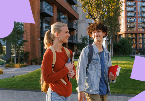
What they told us: Young people want to see images of real people, not cartoons. Any visuals should strike the balance between too childish and too corporate or clinical.
- We used that initial research to develop 4 different design options—and then launched another survey nationwide for our peer educators and other students.
What they told us: Young people prefer clean, minimal design with structured layouts. They value visual clarity and readability.
- We used those insights to create the foundation of our new look.
What we came up with: We increased spacing and text hierarchy to make our pages feel less dense. We also use color sparingly, like pops of color to call attention to important information. We also moved away from cartoon imagery and toward incorporating photography.
Our updated peer educator training launched a few months ago, and so far, the response has been enthusiastic. We’ve already seen strong early uptake, with more than 200 new registrations since the relaunch, along with a significant number of returning participants revisiting the training to explore the updates. We are grateful to have had the time and space through Launch to test our hypothesis with our end users and devote our energies to this much-needed redesign.